Friday, May 26, 2006

Out With The Old, In With The New

The Old...


The New...


What is it about architecture that gets people so excited? Very few people know anything about architecture, and it's not like it has a presence in the Canadian school curriculum, yet everyone seems to have an opinion on it. "Why is it on stilts?" "What is the point of the red neon?" and "It looks like a gherkin".
Most of these responses I find are reduced to matters of aesthetic judgment based on individual taste. Very few comments are constructive, "I don't like it BECAUSE...".
Some people are just opposed to change. "Not in my backyard!!" is their battle cry - which is interesting to me.
These NIMBY's are a strange breed. They're not opposed to architectural change but as long as it doesn't affect them. They want nothing to do with it. But they don't care if it goes on somewhere else.

I currently reside in the Toronto neighborhood of The Annex, which is not unlike other places I have lived like Edgemont Village in Vancouver or Cook Street Village in Victoria. These communities are full of history and have become sought after locations for many people. These communities have developed over the years into cultural and economic diamonds within their respective cities. People are attached to them and get a strong sense of community from them. Changing what is seen to be as a perfect balance of residential retail and cultural facilities simply scares people. Maybe more nervous than scared.
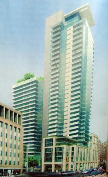
In the mail yesterday arrived a promotional pamphlet for a development down the street at Bloor Street West and Bedford Road. I've become more interested in these types of pamphlets and flyers in the past few years, not from a condo buying perspective, but from an architectural perspective. The project, One Bedford, is a two tower development across the street from the ROM and the Royal Conservatory of Music [which are both undergoing a major expansion along with the Varsity Stadium across the street] and is causing a bit of fuss in the area. Most see it as a massively out scaled project which sets up Bloor Street West for major land development.
The expected population increase for Toronto is upwards of 1 million people in the next 10 to 15 years. What I find curious is that the current population seems to have an ignorant and/or arrogant view when it comes to this daunting problem. The residents are happy more or less with where and how they live, and are unwilling to accept the changes necessary to absorb this potential problem.
In a recently updated Master Urban Plan for the city major traffic corridors were deemed to be key areas for future development. These designated corridors, paired with city infrastructure [Subways] make certain areas major residential development areas. A quick trip up Yonge street between Sheppard and Finch easily shows this in full effect.
So why then are people getting so excited about this building? Is it the height? Is it just the fact that it is a modern tower which proposes a different way of living? It's not a crazy design. In fact it's by one of the top architecture firms in Toronto.
I think what I find so interesting is that The Annex community is regarded as being extremely well educated [having the highest concentration of PhD's in Canada] yet the residents retreat to an isolationist type of thinking when development comes knocking. There's no intelligent conversation between either side. It's simply "we hate it, not here". The argument continues over about a year and a half at various community meetings and municipal development appeal processes until a moment of critical mass where the project is either built or scrapped. If scrapped the project is usually redesigned, gestates for a while and is eventually reproposed. In the case of the Bloor and Bedford site the project was proposed as a 19-storey tower some years ago but was shot down for various reasons. It was reproposed early in 2005 with a completely new design and interestingly was approved for construction. Interesting since the new design is significantly larger than the last one.

Tuesday, May 23, 2006

Panel three and panel two


Here's a rendering looking from the beach towards Santa Monica Canyon. The gap in the roof is an indicator of where the river output was before my massive building went in. The roof undulates as it gets closer to this area of maximum environmental degradation until the roof finally fractures into an opening.


This is a "European Remote Sensing 1" satellite radar image of stormwater runoff plumes from the LA and San Gabriel Rivers into the LA and Long Beach Harbors. The predominant all-black spots are the warmer fresh water billowing out into the Pacific ocean and was a major inspiration for the damage the water has on the local area. This image made up almost an entire panel of my 5 panel layout.

Monday, May 22, 2006

The fifth panel


So the general theme of the project was one set in the future when the famous coastal bluffs of the Pacific palisades are being aggressively attacked and eroded by rising sea levels. In keeping with LA's massive engineering infrastructure the entire beach is blanketed with a steel mesh with a design appropriated from land erosion prevention systems and covered with a surface capable of treating polluted water runoff from the mainland. Humans will inhabit the space between this massive 'blanket' and the beach below. Water will be taken from a polluted river which flows through the site and pumped up onto the roof through a series of 2 meter wide poles which do double duty holding up the roof. The water is filtered and pours through the roof at select locations. The water pouring off the roof creates the walls of the program. [one cannot get into the pool without walking through a wall of 'clean' water]. The view above is from the PCH highway looking south. You can see the trusses in the grid formation taken from the erosion systems, and in some spots you can see the water pouring off the roof to create the walls.

More to come!

I tried just posting the panels as I printed them, but there is so much detail in them it was lost when it gets shrunk from 35inches to 5inches - so only certain parts will get posted.

Sunday, May 14, 2006

Taking a risk, Taking a break

Ian Chodikoff, the editor of Canadian Architect Magazine came up to me after my year end presentation and told me "It's really good. Aggressive. Good work." As did Bruce Kuwabara, Bridgette Shim, and Diana Balmori.

I was extremely nervous going into my final review as I had very little resolved with about 9 days until my presentation. I didn't have a building. I had a lot of research and a lot of ideas but nothing had developed over the previous weeks.
On the last day of school my studio supervisor Bridgette Shim came up to me and told me with a smile: "You have a lot of work to do."
I have stated earlier that I was going to dive into a classic 'student project' complete with all the customary trappings: crazy visuals, aggressive ideas, a complete lack of reality....
I even added things that were quite unusual for an architectural poster/panel: such as a girl in a bikini wearing a gas mask. Now I could explain it all and I could make it all make sense, but it was just so different from anything anyone had done all year that I wasn't too sure as to what to expect.
"You have got balls of steel." was Johanna's response when she saw my panels which were equaled by my model which was so large and conceptual that the main roof surface [which I had made out of a stiff galvanized steel mesh which I laminated to a black canvass fabric] started to pour off the edges of the site model and onto the floor - piling up around the feet of the critics.
All in all my fellows students were quite engaged in my project and really got behind me on it. But none of them knew how the critics would take it.
In the past eight months I've seen what I thought were good projects get destroyed by an agitated panel of critics. I though I was totally setting myself up for this as there were obvious holes in my project [The main issue I had was the major problem of detailed plans of where things went like change rooms, restaurants, retail spaces etc... I had ideas and some areas were demarcated but the specifics were lacking].

The project was so big that some things needed to be left behind or ignored for the greater good. It was a lesson for all of us in the successful representation of our projects and how to show off our ideas the best way possible. No one could do everything on the massive list of things they asked us to do. So instead we have to edit the list down to the most important things there and try to blend things together to make the list smaller. So if I could somehow come up with a diagrammatic sectional perspective drawing instead of a diagram, a section, and a perspective I could in fact have three things in one drawing instead of having to do three drawings. I tried to make sure I got 4 hours of sleep a night for the last two weeks of school and somehow I got it done to a point where I felt I could present it.
I'll post the panels here in the next day or so....